

KPIs & data analytics
Once data is ingested, it becomes something you can manage by. Admire turns it into KPIs and dashboards, so you can monitor performance precisely and across the whole picture in one place. Every number is powered by a query, in plain English or SQL, so it shows exactly what you need and nothing more.
Dashboards for monitoring
Section titled “Dashboards for monitoring”A dashboard visualizes the data you have ingested, giving a team or an individual one place to see how they are performing instead of piecing it together from disjointed sources. Add variables (a date range, a team selector) so one dashboard answers many questions across people and periods.
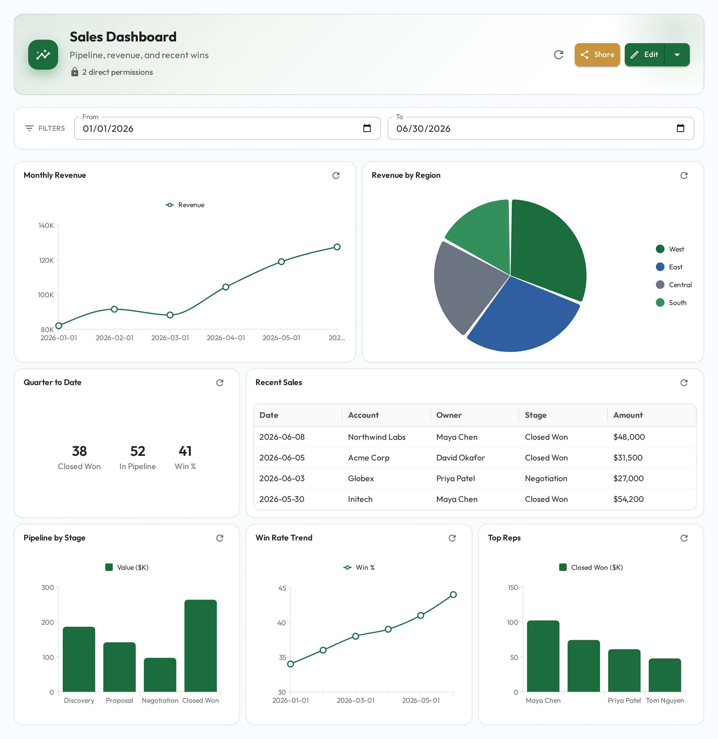
Precise metrics, written as queries
Section titled “Precise metrics, written as queries”Each widget is driven by a query. Describe what you want in plain English and Admire drafts the query and picks the chart, line, bar, pie, stat card, or table, from the shape of the result. You don’t need to be a SQL expert to put a precise metric on screen.
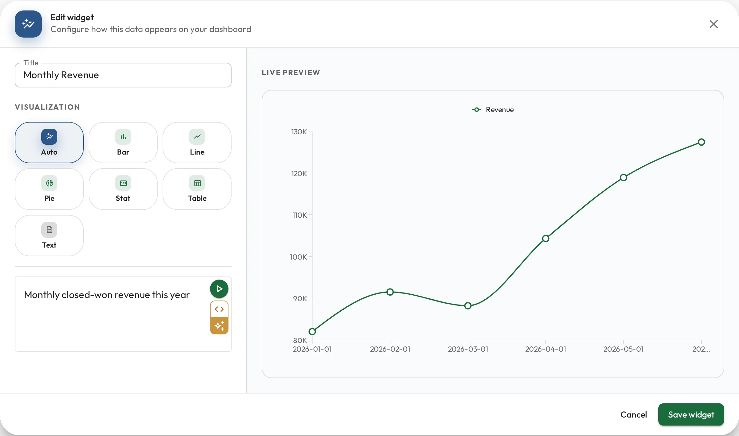
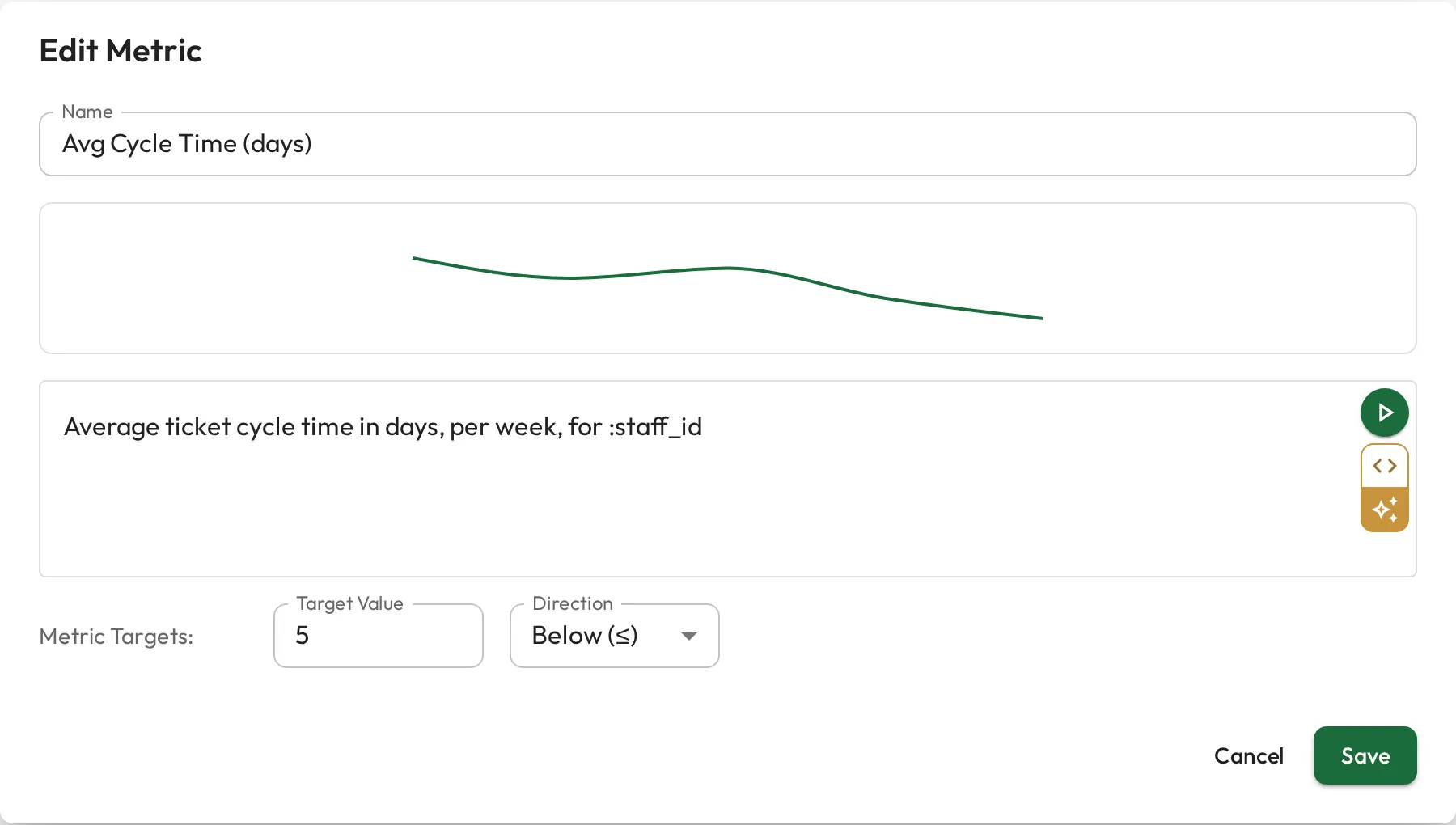
Average ticket cycle time in days, per week, for :staff_id
SELECT date_trunc('week', closed_at) AS week, AVG(cycle_days) AS avg_cycle_daysFROM ticketsWHERE assignee_id = :staff_idGROUP BY weekORDER BY weekRole metrics: a KPI per person
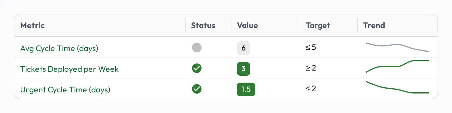
Section titled “Role metrics: a KPI per person”A query doesn’t have to live on a dashboard. Attach one to a role as a role metric and Admire runs it per person (filling in each person’s :staff_id), so the same definition produces everyone’s number. Give it a target and a direction, and each person’s profile shows a status-colored sparkline that updates as the data does, with no one stopping to tally it.
See Role metrics for the full setup.
To act on what the numbers show across a group, see Team capability & skill gaps.