

Dashboards
Dashboards let you build your own views of your data, bringing the numbers that matter into one place. Where a staff profile shows how one person is doing, a dashboard zooms out to the performance that surrounds them: how a team is tracking, how a role is progressing, or the statistics behind the workflows your people run. Those views are meant to feed coaching. The data gives a manager and their coachee something concrete to discuss, and turns a vague “how are things going” into a specific conversation about what to do next.
For coaching activity itself rather than your own metrics, see the Progress Feed.
They work upward as well. A director and above can sit down with their managers around a shared dashboard and use it as the conversation point, so every layer of leadership is looking at the same picture of how its part of the organization is developing.
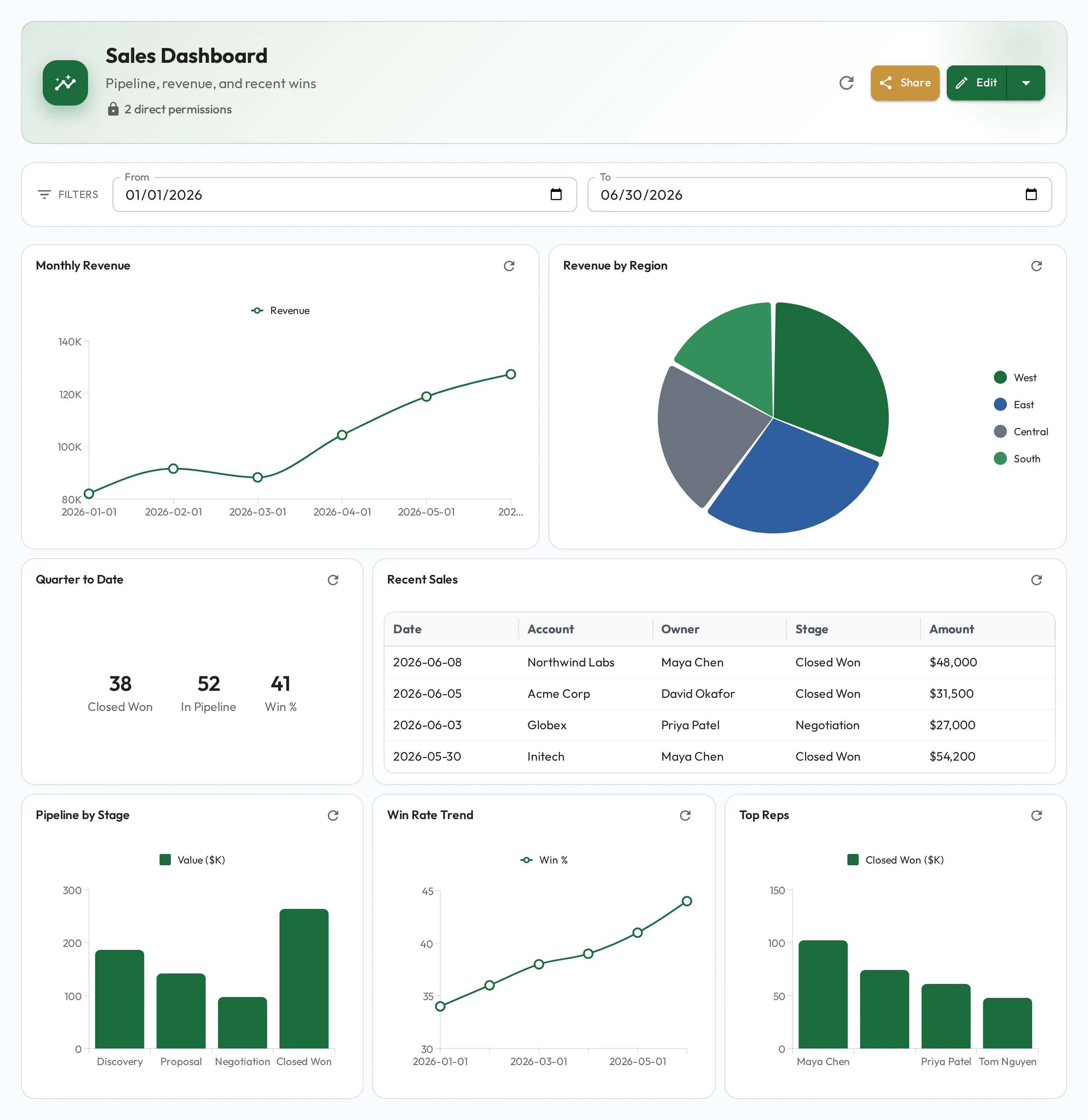
Building a dashboard
Section titled “Building a dashboard”Add widgets to a dashboard and arrange them with drag-and-drop. Most chart widgets are driven by a query; you can also add text widgets for headings and context, no query needed. When you add or edit a widget, pick its type from a visual grid and a live preview updates as you configure it.
On a phone or a narrow window there is no room for the arrangement you built, so widgets stack full-width in that order and dragging and resizing are turned off — you can still add, edit and delete them, but rearranging needs a wider screen.
Widget types
Section titled “Widget types”Admire picks the visualization automatically from the shape of your query’s result, so the way you write the query determines the chart:
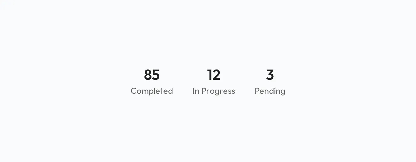
- Stat card: a single row of one to three numbers (e.g. a total).
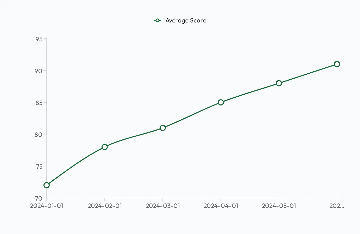
- Line chart: a date column plus one or more numeric columns (a trend).
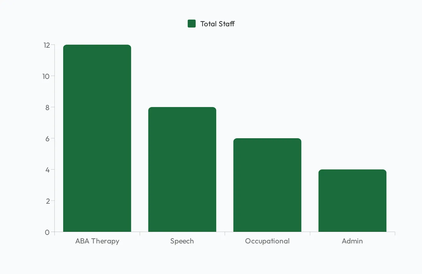
- Bar chart: one or more categories plus numeric values.
- Pie chart: one category column plus one numeric column, over a handful of rows.
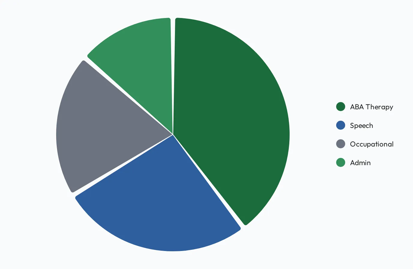
- Table: the fallback for anything else.
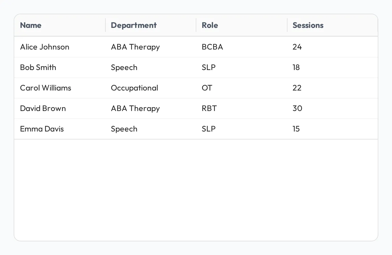
- Text: static rich text for headings and context (no query). Turn on Hide card frame to drop the surrounding card so the text reads as inline prose or a section heading between widgets.
Because the display follows the result, shape the query to shape the chart: rename columns to set the axis and series labels, group to set the categories, and order rows the way you want them shown. You can also override the auto-detected type per widget when you want a specific chart.
Variables
Section titled “Variables”Use dashboard variables to make a dashboard interactive, for example to filter by team or date range, so one dashboard answers many versions of the same question. Variables fill the :placeholders in each widget’s query.
A variable’s Type sets the control viewers see in the filter bar:
| Type | Control | What the query receives |
|---|---|---|
text | Text field | The text typed |
number | Number field | The number |
date | Date picker | The date |
select | Drop-down of the options you list under Select Options | The option chosen |
user | Person picker | The person’s ID |
role | Role picker | The role’s ID |
team | Team picker | The team’s ID |
A role or team picker starts on its Default Value, or empty (All roles / All teams) when it has none. An empty picker passes an empty value (NULL), so write the filter to keep everyone in that case. Add ::bigint where the query tests for the empty value; without it the query fails once a role or team is picked:
WHERE (:team::bigint IS NULL OR t.team_id = :team)Writing the queries
Section titled “Writing the queries”You don’t need to be a SQL expert. Describe what you want in plain English and Admire drafts the query, or write SQL directly if you prefer. See Querying your data (SQL).
Sharing a dashboard
Section titled “Sharing a dashboard”If you have Full access to a dashboard, select Share to give a person, team, or role access to it. Once you pick who to add, the dialog also checks whether they can read the data sources its widgets depend on. See Sharing sources & dashboards.